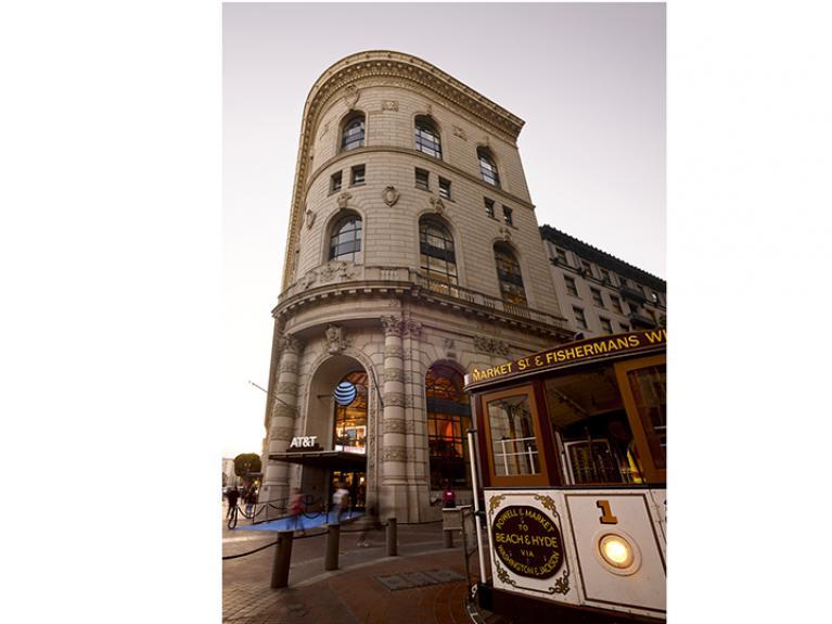
AT&T goes big in San Francisco, puts modern spin on historic building
[cw_slider id=200803]
AT&T is pulling out all the stops in San Francisco, opening its largest, most elaborate and most tech-centered store to date.
The new, two-level 24,000-sq.-ft. flagship is housed in an historic building located next to the busy and popular cable car turnaround on Powell Street. Constructed in 1908, the building has been restored from floor to ceiling back to its original Baroque architectural design.
The store gives a modern twist to the building, which has National Historic Landmark status. In a nod to the Bay Area's multicultural history and international visitors, visitors are greeted by an 8-ft. marble globe that has the word "hello" written in 32 different languages. A custom 48-ft. x 5-ft. curved digital display is on bulkhead that overlooks the second level balcony. This electronic canvas features custom fluid art created specifically for this store by artist Joshua Davis.
The first floor showcases AT&T’s range of products and services, along with accessories.
Getting all the escalator at the of the second, shoppers are welcomed by a hologram that speaks to AT&T's innovation and evolution. The entire second floor is designed as an interactive, forward-thinking tech playground that highlights connectivity through the Internet of Things (IoT), and features six interactive experience zones, including entertainment, the smart home and connected car.
Customers have the ability to interact with each experience through touchscreen technology on 98-inch monitors and connected products such as a smart refrigerator, with everything intended to showcase how simple a connected life can be.
“Many people are curious about current and future technology – but they are quick to dismiss it as irrelevant, intimidating or inaccessible,” said Jonathan Lander, director of strategic retail for AT&T. “Everything about the second floor – from the consumer journey, to environmental design, to an intuitive UI and opt-in content in bite-sized chunks – all of it was designed to break down barriers and invite discovery of the connected lifestyle.”
The floor is loaded with state-of-the-art digital content, including intuitive UI and short 30- to 60- second animated vignettes that lets customers invest time in the topics that interest them.
“We specifically created experiences to entertain, educate, and inspire consumers about what a connected life can mean to them,” said Mimi Lettunich, founder and executive creative director, Twenty Four 7, Portland, Oregon, which is responsible for the store’s environmental design, graphic / interactive / UI design, storytelling, and content creation.


